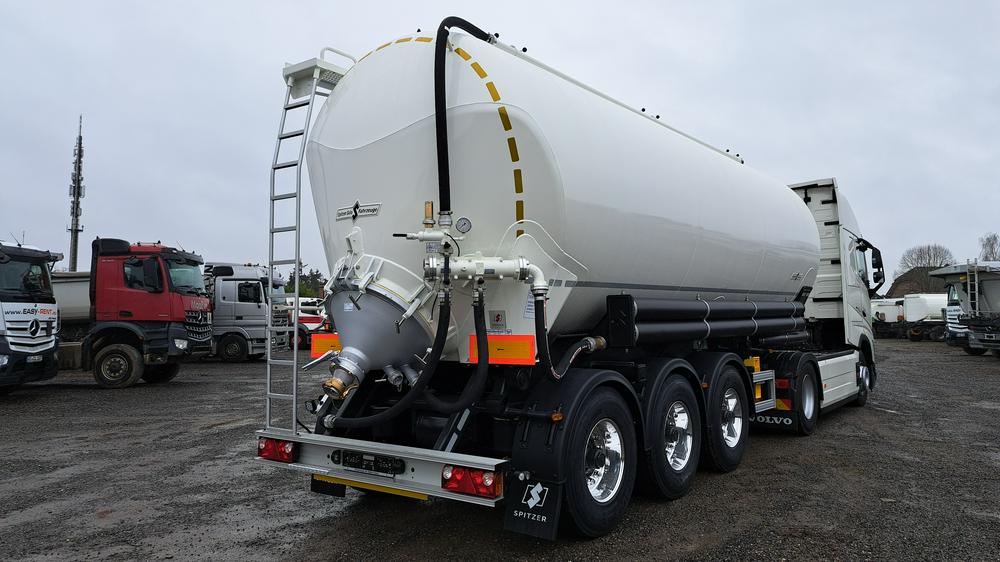
Alsdorf (DE)
Silo semitrailer (tipping)
SPITZER SK 2738 CAL
- First registration
- 16.05.2024
- Number of axles
- 3
Example – a child that starts in column 2 and spans 6 columns:
Use additional classes to change the layout per media query: "gi-{start column}-{end column}-{media query}"Example – a child that starts in column 1 and ends in column 8, but starts in column 3 in the media query "tablet-up":Example – a child that starts in column 1 and spans 2 columns, but spans 4 columns in the media query "desktop-up":Beware: All column numbers are calculated using the highest available number of columns in any viewport and scaled down.Example – a grid that has 4 columns on small viewports, but 12 columns in media queries for larger viewports:In this grid, all class numbers will be based on 12 columns and scaled down for the 4-column version.The class "gi-1-6" will result in a child that starts in column 1 and ends in column 2 on small viewports,but actually ends in column 6 on larger viewports.The intent of this conversion is to minimize the necessity for the aforementioned additional re-layout classes.A child with the class "gi-1-6" takes up half of the grid, even when that grid has fewer columns on smaller viewports.If the grid is needed inside of a child element, the "g" class can be used on the element or any element inside it.This sub-grid does not have outer margin columns and uses the same number of columns that the element itself occupies.If no other CSS interferes, the columns of a sub-grid should line up perfectly with the columns of the parent grid.Example: